System overview
A quick read on your account — storage, users, maps, interactions and the areas getting attention.
Go to Analytics → System overview. This page answers "how much of my account am I using": how much storage is left, how many users, how many maps are running, whether customers are interacting much, and which areas are getting the most attention.
Different from the Reports area
This page looks at the whole account — every dataset merged. The Reports area always looks at one dataset at a time and drills into individual stores.
The three cards at the top
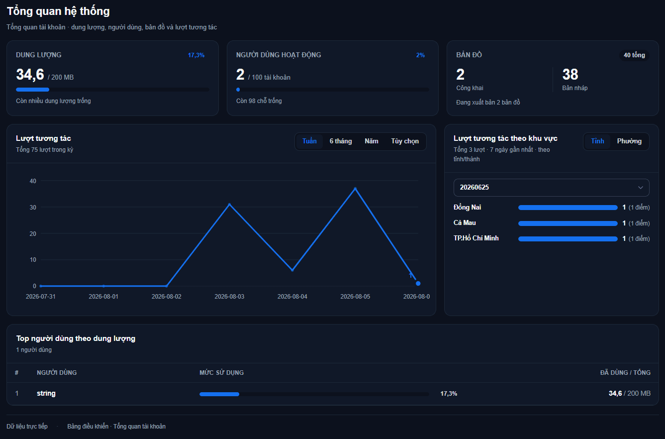
| Card | What it shows | Meaning |
|---|---|---|
| Storage | Used / Total + percentage | How much space your account's datasets occupy, in GB |
| Active users | Active / Limit + free seats | Members of the account who are not deactivated |
| Maps | Public / Draft + total | Published maps and maps still being built |
The two numbers on the Storage card
Both are for the whole account, not broken down per member.
Used is the real space every dataset in the account occupies in the database — whoever created it, it counts here. Total is your account's quota under its service plan.
The Storage card changes colour with usage so you are never caught out:
- Below 75% — plenty of room left.
- From 75% — using a lot of space.
- From 90% — nearly full, consider raising the quota.
What to do when storage is nearly full
Delete datasets you no longer use (see Managing data), or contact support to raise the quota. Once full, the system blocks uploads and reports a quota error.
Storage is shared across the account
The quota belongs to the whole account; members draw from one pool. One person uploading a lot of data uses up everyone's room, and when it is full every member is blocked from uploading, not just the one who filled it.
The Top users by storage table at the bottom of the page shows who is taking the most, so you know whom to ask to clean up.
The interactions chart
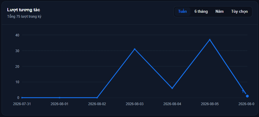
This line chart shows total customer interactions over time, merged across every dataset in the account: each time a customer opens a store's information or taps directions, it is added here. The line under the title gives the total for the selected range.
Only published maps produce numbers
These figures come from customers viewing public maps — and only published maps can be viewed. Draft maps contribute zero, and your own actions while building a map are not counted either.
So an empty chart while you work every day is normal: either nothing is published, or it is published and nobody has visited yet.
Why does this total differ from the Reports area?
This chart adds up every dataset in the account. The Reports area always shows one dataset, the one selected at the right of the tab bar. That is the main reason the two numbers differ — neither is wrong.
On top of that, a map that was public and then taken down keeps its history in this chart, whereas the Reports dataset picker only lists currently public maps.
Four time ranges:
- Week — the last 7 days, one point per day.
- 6 months — the last 6 months, one point per month.
- Year — the last 12 months, one point per month.
- Custom — pick your own start and end date; future dates are not allowed. A range longer than 92 days is automatically grouped by month for readability.
Empty points are drawn as 0 rather than skipped, so the line is always continuous. The final point is highlighted with its value. When there are many points, the horizontal labels thin out — the line itself is still drawn in full.
Daily is as fine-grained as it gets
Interactions are counted by day, never by hour. That is why no report breaks the day into time slots.
Interactions by area
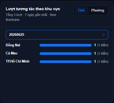
This block takes one dataset and groups customer interactions by administrative area, so you can see which areas draw the most attention.
- Pick a dataset in the bar above the list. If the account has only one public dataset, its name is fixed and there is nothing to pick.
- Toggle between Province and Ward for a broad or detailed view.
- The list runs highest to lowest, each row showing the count plus the number of stores in brackets.
Read the two numbers correctly
The large number is the area's interactions. The bracketed "(N stores with interactions)" means exactly that — only stores that had interactions, not the total number of stores you have there.
The list shows at most 15 areas with the highest counts.
This block always covers the last 7 days
The Week / 6 months / Year selector only applies to the chart beside it. The area list always covers the last 7 days, whatever range you set for the chart.
If the list is empty with a "records not matched to an administrative area" note, it means your stores have not been resolved to a province/ward. Those stores are excluded from area statistics (but still counted in the chart beside it).
Top users by storage

A ranking of the users taking the most storage, 10 rows per page, with Previous / Next to page through. Each row shows a figure in MB and a usage bar — that bar shows what percentage of the whole account's quota that person occupies, so adding up every row's percentage gives exactly the fill level on the Storage card.
The Used column is the total size of the datasets that person created. This is an allocation table showing who takes what out of the shared pool — not a per-person quota, since there is only one quota for the whole account.
Only people who have created data appear
The table only lists people who have created at least one dataset. Members who have not created any will not appear even if they are active — so this table usually has fewer rows than the Active users card suggests.
Use this table when the account is nearly full: it points straight at who should clean up first.
When the page shows no numbers
The page never shows fabricated numbers. If a block cannot fetch its data, it shows a message instead of a figure:
- "Could not load the interactions chart" — the chart failed to fetch data.
- "No interaction data yet" — the fetch worked but there were no interactions in that range.
- "Could not load user data" — the ranking table failed to fetch data.
The usual fix: reload the page and check your network connection; if it persists after a few minutes, contact support.
Do not add the two numbers on this page together
The Interactions chart and the Interactions by area list count the same behaviour. The area figure is a subset of the chart figure, because it takes one dataset only, the last 7 days only, and skips stores with no matched area. Adding them together double-counts.
Requires the dashboard view permission
This entire page requires the dashboard view permission. If you cannot see the Analytics menu, ask your account administrator to grant it.
Next: Getting started with analytics — understand how the Reports area is organised before diving into individual reports.