Area analysis
Interactions and supply–demand by province/ward, with two visual maps.
The Areas group answers "where is my chain strong and where is it weak" by administrative boundary. Two sub-tabs: Summary (numbers) and Map (visual).
Summary
This tab works broad to narrow: it shows provinces by default, and clicking one opens the wards inside it. Use the back button to return to province level.
Why not show wards straight away?
The country has tens of thousands of wards. Showing them all at once would be both slow and unreadable, so the system only loads the wards of the province you opened.
There are two view modes, selected at the left of the title bar.
"Interactions" mode
Ranks areas by the number of customer interactions with stores inside them, alongside how many stores had interactions (not the total number of stores you have there). Use it to see which areas get the most attention.
Stores not matched to a province/ward are excluded from this table — so the total here can be smaller than the dataset's real interaction total.
"Demand vs. Stores" mode
Puts demand and supply side by side for each area:
| Column | Meaning |
|---|---|
| Searches | How many times customers searched within this area — a proxy for demand |
| Empty searches | Of those, how many returned no results |
| Stores | How many stores you have in the area — a proxy for supply |
| Verdict | The automatic conclusion, see below |
Three verdicts, evaluated in order:
- Open a store here — the area has no stores at all, yet customers keep searching.
- Review coverage — there are stores, but there are still searches returning nothing.
- Covered — there are stores and no empty searches.
Only areas where someone searched
The table only lists areas with at least one search in the period. An area nobody searched will not appear — even if you have stores there.
Demand is counted independently of supply
The Searches figure comes from customer search behaviour, regardless of how many stores you have there. That is why an area with no stores at all can still show high search volume — and that is exactly the expansion opportunity.
Map
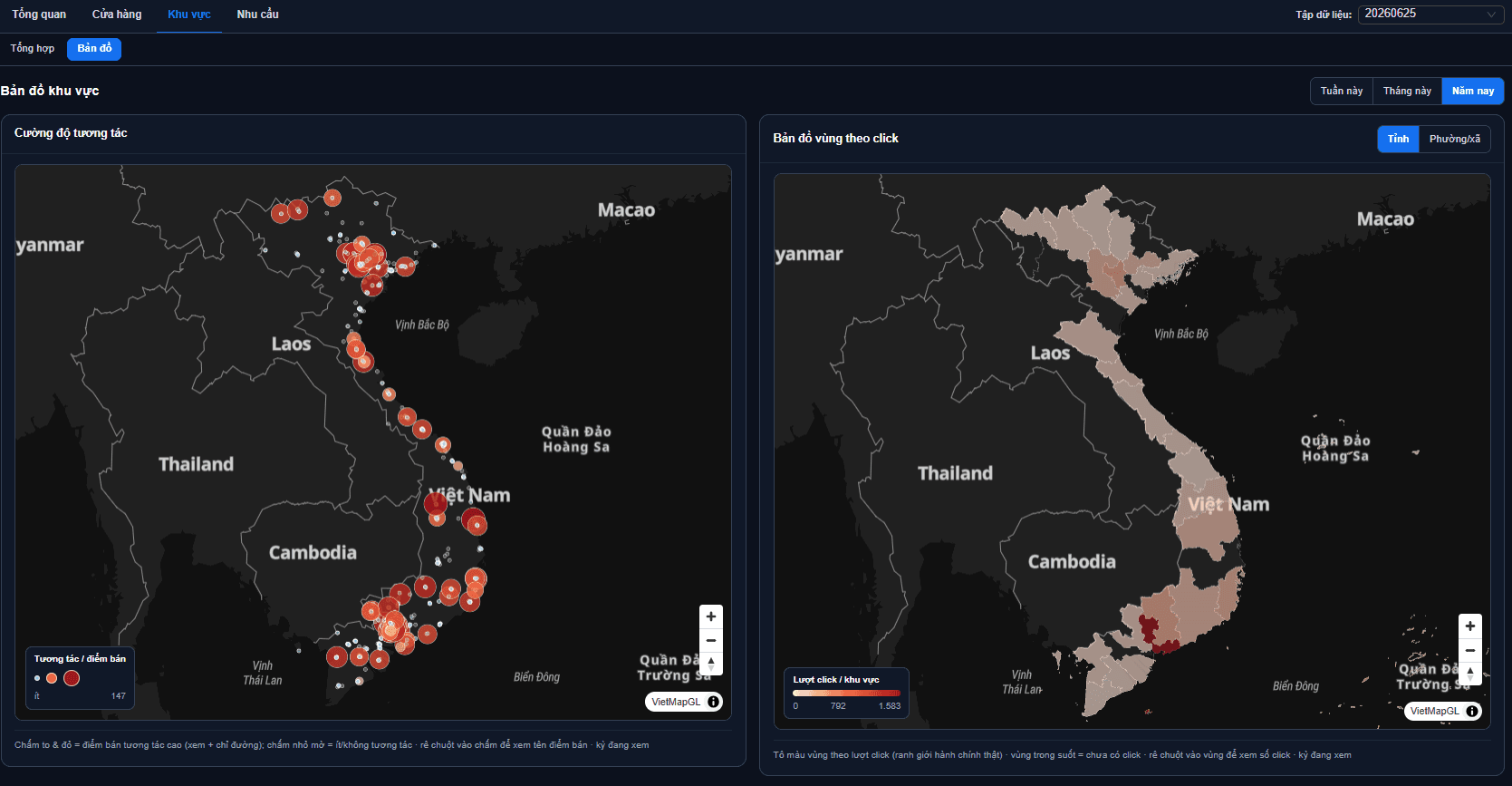
This tab puts two maps side by side, sharing one period picker at the top so you are always comparing the same time frame.
Interaction intensity
A heatmap by individual store: dense interaction shows as a stronger colour. Use it to spot clusters of customers, including ones straddling administrative boundaries.
Click choropleth
Colours administrative boundaries by interaction count. This map has its own Province / Ward picker at the top of the frame to change the level of detail.
The two maps look at different things
The heatmap follows store positions, the choropleth follows administrative boundaries. A cluster of customers sitting between two provinces shows clearly on the heatmap but gets split in half on the choropleth.
On narrow screens the two maps stack into a single column.
When an area has no data
If the table or map is empty, the usual cause is stores not matched to an administrative area — the system does not know which province/ward they belong to, so it cannot group them. Check your coordinate data in Managing data.
Next: Demand analysis — what customers are looking for that you do not have.